
Color Chemistry: How to Match Art Prints to Your Interior Palette
If your home has a color scheme you love — why not make your wall art part of the conversation? Matching art to your interior palette doesn’t mean everything has to be the same hue. It’s about harmony, contrast, and intention. Let’s break it down so you can hang with confidence.
1. Know Your Color DNA
Start by identifying your space’s dominant colors. Look at your walls, large furniture, rugs, or curtains. These tones form the foundation of your palette. Next, identify accent colors (pillows, vases, throws) — they’re your styling allies.
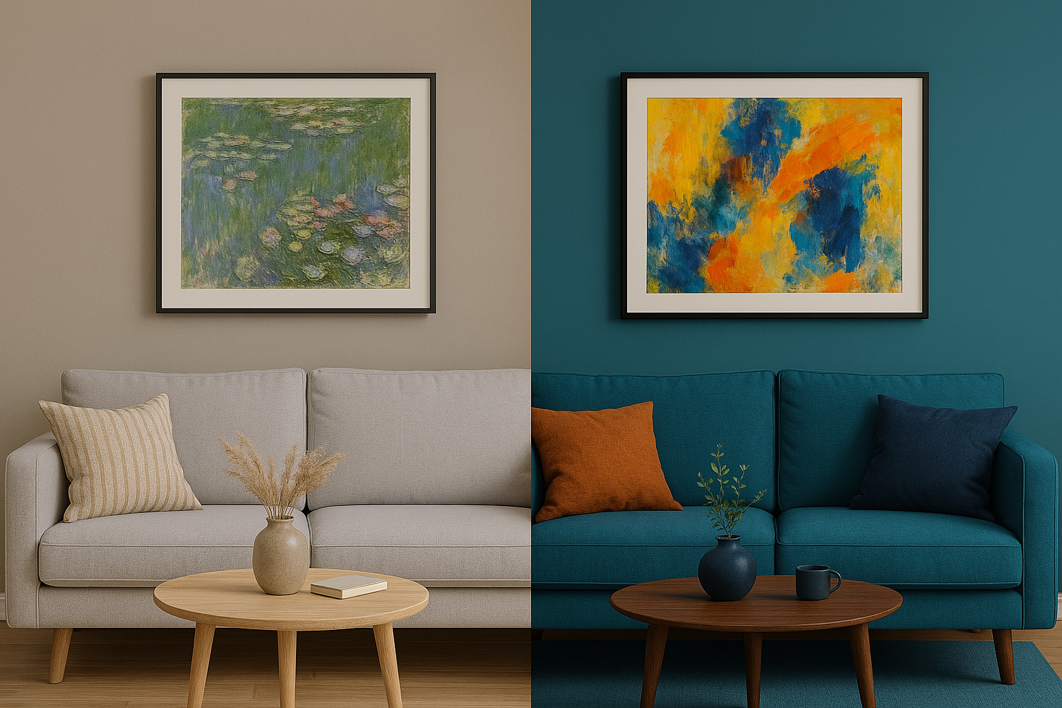
2. Complement, Don’t Copy
You don’t need an exact color match — in fact, that can look flat. Instead, find art that includes complementary tones. For instance:
• Beige + Earthy Orange: Works beautifully with warm-toned landscapes.
• Teal + Brass: Pair with abstract prints in cool blues and golds.
• Greige + Blush: Consider minimalist florals or soft watercolor pieces.
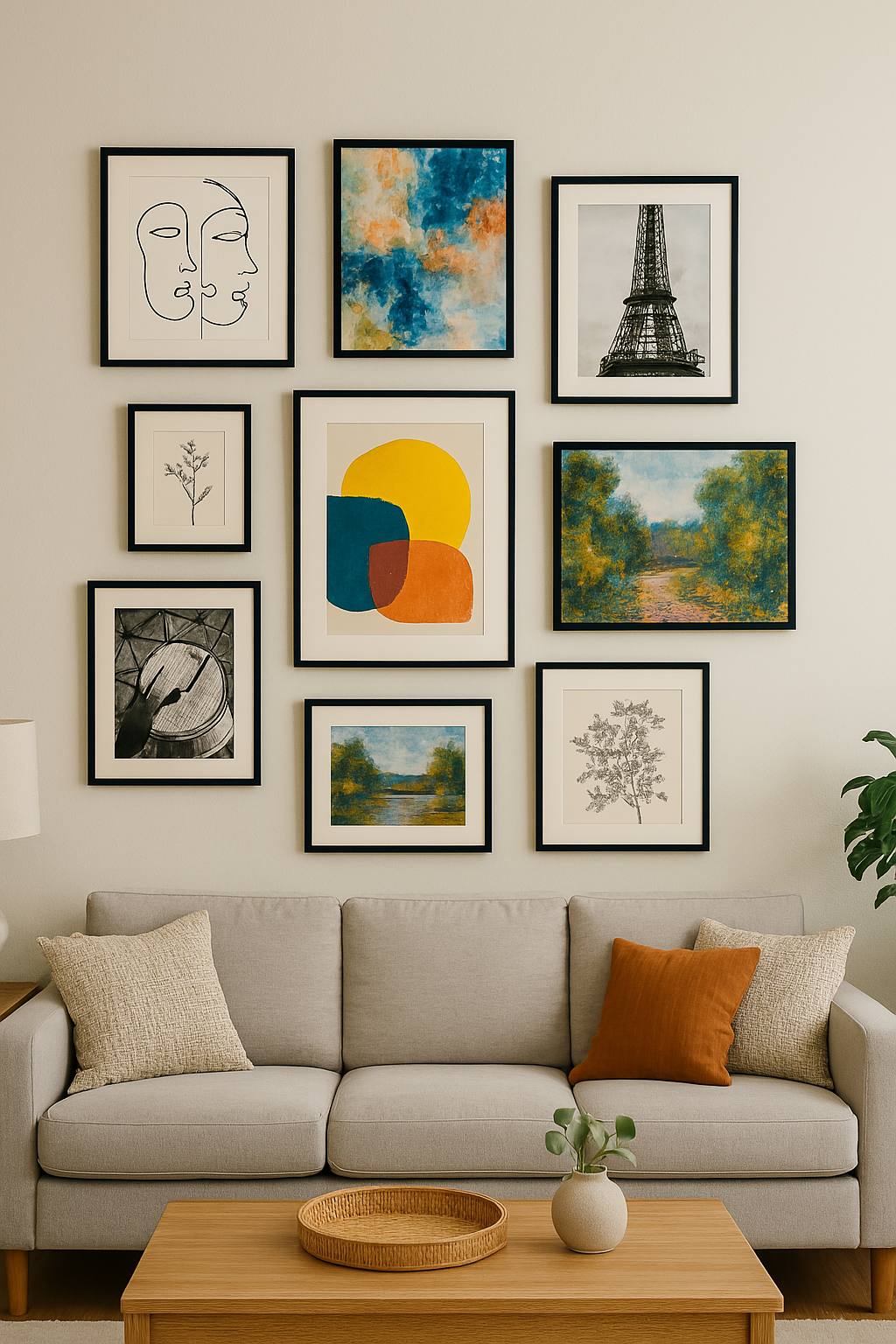
3. Use the 60-30-10 Rule
This interior design trick helps balance color:
• 60% dominant color (walls, sofa)
• 30% secondary (rugs, chairs)
• 10% accent (art, pillows)
Let your wall art fall into that 10% — making it the pop of personality that ties everything together.
4. Think Mood, Not Just Match
Colors evoke feelings. A pale blue room with fiery red art might be jarring, unless that contrast is the vibe. Calm tones call for serene artwork. Bold rooms love bold prints. Match the emotion, not just the color wheel.
5. When in Doubt, Go Monochrome
You can’t go wrong with black-and-white or grayscale artwork — especially in colorful rooms. Monochrome adds elegance, balances bold decor, and works with virtually any style.
Bonus Tip: Test It Before You Hang It
Try holding your phone up to the wall and using a color picker app to see how different art prints “sit” in your space. Better yet — order a small test print first!
Final Thoughts
Art doesn’t just decorate your space — it completes it. Choosing the right piece for your palette creates a visual rhythm that makes your home feel cohesive and considered. Browse our carefully curated collection at PrintOpenArt.com and find the print that brings your color story to life.